As part of a recent upgrade to my computer I purchased an Nvidia GeForce 8600GT. While reading about it on the Ubuntu Forums I noticed that a lot of people were having difficulty getting it to work in Ubuntu. I researched the Ubuntu Forums for the answer and eventually found it, but I thought I would post the simple version here.
To start with, I was installing Ubuntu from scratch because I wanted to upgrade to the 64-bit version to match my new processor. Unfortunately the live CD was unable to correctly configure my graphics card. It was using an incorrect video mode that was making my monitor freak out. All it showed was a black screen, but when I reset my computer it still gave me a black screen (when the BIOS screens should have been visible). Powering it off and on didn't help, so I had to actually unplug my monitor's power and plug it back in to get it to stop wigging out.
In order to install Ubuntu I had to download the alternate install CD. Obviously my graphics card was able to handle the text-mode installer, and after booting Ubuntu for the first time, again to a black screen, I hit CTRL-ALT-F1 and edited /etc/X11/xorg.conf to change the "nvidia" driver to the "nv" driver.
This is only a temporary solution because the "nv" driver is not 3D accelerated, so the final step is to download and install Envy and allow it to install the Nvidia driver for you. Envy recognizes the 8600GT card and correctly configures your xorg.conf.
Friday, August 3, 2007
Tuesday, July 3, 2007
Wallpapers for Robots
System.out.println("Commencing Transmission...");
Every robot needs some good wallpaper. I tend to change my desktop wallpaper at least once a week, so I have a variety of sources from which I get good wallpaper. I also require a wide variety of wallpaper because I use many different desktop aspect ratios including standard, widescreen, and dual-monitor. These are the sites that I have found to be best for high-quality wallpapers:
Standard resolutions:
GNOME-Look
KDE-Look
Standard or Widescreen:
Interfacelift
Dual-monitor:
DMB
Yahoo seems to have the best image search because they allow you to search for images that have the aspect ratio of a desktop background (click the wallpaper button in the top right corner).
System.out.println("...Transmission Complete");
Friday, June 15, 2007
Amarok 2.0 Progress Report
Many Linux users consider Amarok to be the greatest media player of all time. Amarok has earned this title through its integration of lyrics, streaming radio, podcasts, Last FM stats, user developed scripts, and more, and by helping users to "Rediscover [their] music."
The current version of Amarok, 1.4.5, was pushed out earlier this year, and development of Amarok 2.0 has been underway ever since. I was curious to see how development is coming along, so I compiled KDE4 and Amarok2 from SVN to get a sneak peek.
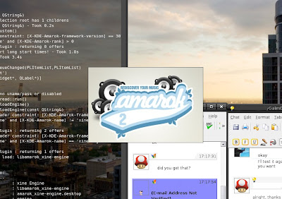
While it's obvious that much is left to be done, it's also obvious that a lot of hard work is going into the redesign. First off, the new splash screen is much easier on the eyes than the muddy blue "Fast Forward" screen I've been staring at for the last half year:
After Amarok loads, the change that is most apparent is the new emphasis placed on the context elements. Instead of the playlist being the focus of Amarok, the context data such as lyrics and wikipedia info take center stage. The playlist now occupies about a third of the screen width on the right. Unfortunately, in the current build the context elements aren't entirely functional, but you can see where they will be placed in the future. Much of the context interface will be implemented in the form of widgets. Previously there had been talk about doing away with the tabs and laying all context items side-by-side, but as you can see they either have yet to implement this, or decided it wasn't a good idea and kept the tabbed interface:
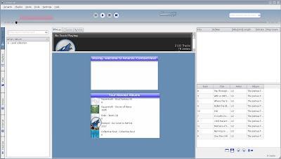
When running Amarok 2.0 in Gnome (using the KDE4 libraries of course), Amarok inherited the collection info from Amarok 1.4.5. It even kept the custom images that I had set for most of the album covers. It is nice to see that (so far) backwards compatibility is a non-issue, as it shouldn't be.
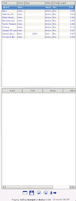
After the context redesign, the next most obvious change is the playlist. Currently, the playlist area is split horizontally in two. The upper area acts like the classic playlist, while it seems that the lower area is used to show all tracks in the current album. At this stage in development, the playlist displays information in exactly the same way as it did in 1.4.5, but the plan is to have it be dynamic and show only relevant info. For example, if a certain track has the title and artist fields filled in, but there is no info about the album name, then only the available information will be displayed, and there will be no empty space where the album name would have been. This can be seen best in the mockup on KDE.news. Here is the playlist in its current state:
Another interesting change is the addition of an internet menu. So far it doesn't do much, but it will be interesting to see how this is used. It would be nice to see it used in a similar manner to Songbird, but it will likely be something more benign.
One change that can't be shown in pictures is the Phonon backend. Typically, Amarok uses Xine or GStreamer as a backend, but now Phonon is included as an option, and will probably become the default in the future. Phonon is an abstraction to Linux sound engines. It performs interactions with Xine and GStreamer (among others) so that Amarok only has to implement the Phonon interface and not a different interface for each engine.
Finally, one of the greatest new features in Amarok 2.0 (although obviously not in this Linux build) is Windows and OSX support. This is wonderful news for those of us that choose to, or have to, use another platform, but don't want to leave their music player behind.
For more information about the future of Amarok, see this article about Amarok 2.0 plans, and an interview with Jeff Mitchell about Amarok 2.0 development on KDE.news.
The current version of Amarok, 1.4.5, was pushed out earlier this year, and development of Amarok 2.0 has been underway ever since. I was curious to see how development is coming along, so I compiled KDE4 and Amarok2 from SVN to get a sneak peek.
While it's obvious that much is left to be done, it's also obvious that a lot of hard work is going into the redesign. First off, the new splash screen is much easier on the eyes than the muddy blue "Fast Forward" screen I've been staring at for the last half year:

After Amarok loads, the change that is most apparent is the new emphasis placed on the context elements. Instead of the playlist being the focus of Amarok, the context data such as lyrics and wikipedia info take center stage. The playlist now occupies about a third of the screen width on the right. Unfortunately, in the current build the context elements aren't entirely functional, but you can see where they will be placed in the future. Much of the context interface will be implemented in the form of widgets. Previously there had been talk about doing away with the tabs and laying all context items side-by-side, but as you can see they either have yet to implement this, or decided it wasn't a good idea and kept the tabbed interface:

When running Amarok 2.0 in Gnome (using the KDE4 libraries of course), Amarok inherited the collection info from Amarok 1.4.5. It even kept the custom images that I had set for most of the album covers. It is nice to see that (so far) backwards compatibility is a non-issue, as it shouldn't be.
After the context redesign, the next most obvious change is the playlist. Currently, the playlist area is split horizontally in two. The upper area acts like the classic playlist, while it seems that the lower area is used to show all tracks in the current album. At this stage in development, the playlist displays information in exactly the same way as it did in 1.4.5, but the plan is to have it be dynamic and show only relevant info. For example, if a certain track has the title and artist fields filled in, but there is no info about the album name, then only the available information will be displayed, and there will be no empty space where the album name would have been. This can be seen best in the mockup on KDE.news. Here is the playlist in its current state:

Another interesting change is the addition of an internet menu. So far it doesn't do much, but it will be interesting to see how this is used. It would be nice to see it used in a similar manner to Songbird, but it will likely be something more benign.
One change that can't be shown in pictures is the Phonon backend. Typically, Amarok uses Xine or GStreamer as a backend, but now Phonon is included as an option, and will probably become the default in the future. Phonon is an abstraction to Linux sound engines. It performs interactions with Xine and GStreamer (among others) so that Amarok only has to implement the Phonon interface and not a different interface for each engine.
Finally, one of the greatest new features in Amarok 2.0 (although obviously not in this Linux build) is Windows and OSX support. This is wonderful news for those of us that choose to, or have to, use another platform, but don't want to leave their music player behind.
For more information about the future of Amarok, see this article about Amarok 2.0 plans, and an interview with Jeff Mitchell about Amarok 2.0 development on KDE.news.
Sunday, June 10, 2007
Kill the PC Speaker
A quick tip for today: How to get rid of the obnoxious pc speaker sounds that are turned on by default in Ubuntu. First we're going to disable the pc speaker kernel module for the running session, then we'll blacklist the module so it doesn't reactivate itself in future sessions. The two commands are as follows:
sudo modprobe -r pcspkr
sudo su -c 'echo blacklist pcspkr >> /etc/modprobe.d/blacklist'
Friday, June 1, 2007
Top 10 Ubuntu Applications
LifeHacker is running a piece on the Top 10 Ubuntu Applications that are exclusive to GNU/Linux. While I agree with most of their choices, the most interesting part of the article are the user's comments where some lesser-known, but excellent apps are pointed out. Read on!
Thursday, May 31, 2007
Fast Mirror
Fast Mirror is a program that I wrote in Java that helps you find which Ubuntu mirror is fastest for you. It checks both latency and bandwidth on all official Ubuntu mirrors. Here is the download. I apologize for the ad-ridden download site, but I don't have my own file hosting yet. To run it, just open a command prompt, cd to the download folder and type:
Be sure that you have Java Runtime installed. Please let me know what you think of it. This is version 0.1, so it is likely to have bugs, but nothing that will bring your system down. ;)
java -jar FastMirror.jar
Be sure that you have Java Runtime installed. Please let me know what you think of it. This is version 0.1, so it is likely to have bugs, but nothing that will bring your system down. ;)
KWin Composite
Here's a project to keep an eye on. New in KDE4 is the latest version of KWin, boasting compositing effects similar to those found in Compiz/Beryl.
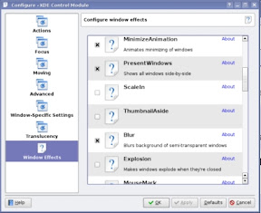
Soon I'll be recompiling KDE4 from SVN to take this for a test drive. Until then, have a look at the announcement on KDE.news.

Soon I'll be recompiling KDE4 from SVN to take this for a test drive. Until then, have a look at the announcement on KDE.news.
Subscribe to:
Comments (Atom)